“Don’t forget, it’s not what you like but what your potential clients like that matters.”
That is probably the most valuable thing I have learnt this week.
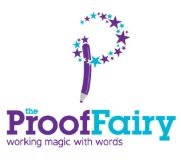
I’m going through a rebrand for The Proof Fairy, and asked Gareth Coxon of Dot Design to come up with a new logo. I had one idea – involving a “mini me” character – and left it to Gareth to come up with some others. He sent me four designs, but two of them didn’t feel right so I ruled them out straight away. The third logo – featuring a pen and stars – was lovely, but the fourth was THE ONE, it was EXACTLY my idea come to life. So that was it – I had my new identity.
I showed a few people and they all loved it too. Then one of them – Jez Hunt of MetaMorph – suggested that I run a poll on which of the two designs people preferred. After all, as he said, “It’s not what you like but what your potential clients like that matters.” Good idea.
So I put the two designs up on my personal website, and posted on the 4Networking forum, Twitter and Facebook, asking people to vote for the one that best represented The Proof Fairy. I was sure “my” idea would be the clear winner.
I’ve never been so wrong! Fifty people voted – and 92% voted for the other design, the pen and stars! People remarked that it worked well for my business and that the “mini me” was just not very professional. So now Gareth is working on some variations of the pen and stars logo, and I’m confident that my new image is going to be perfect for The Proof Fairy.
But boy oh boy, that could have been an expensive mistake. If I’d gone with my own choice, I could have seriously damaged my business, because I just wouldn’t have been projecting the right impression. I’m so pleased that I decided to open it up to the public vote!
Whenever you’re working on your business, whatever you may do, always think about what your customer will like or need. What you like doesn’t really matter. Of course you can’t completely go against your own judgement, but sometimes you need to take a step back and look at your business from a different perspective. Perhaps the lesson to be learnt here is that whatever we may think, the customer usually is right!


Thank you for posting this. it brings it home how important it is to know what the people who are looking at what we think is good relly think.
It’s often the case that your perception of what is good isn’t what the general public thinks. I wish I’d had a chance to see the other logo.
I remember doing some business card designs for a client: one was brilliant, one was so-so and the other was truly awful. She chose the third one and was really pleased with it! Just goes to show my taste certainly wasn’t the same as hers.
I probably would have chosen the design you liked, because I believe it would have been nicer, albeit not the most popular one.
I really like that logo!
Nice case study (more so if we could see the alternative) but this is a sample of one business.
…. and I’m not sure why you would be using a rubber pencil, however?
I would expect you’d want a logo to help implement your brand strategy, not those of your clients. I expect a such a resounding results shows you something in your instance, but in general your branding strategy should reflect your future planning. Focus groups look are viewpoints at one moment in time and market research is a rear-view mirror.
Perhaps its the communication with your customers that is actually the valuable part!
If you’d like to see all four logos that Gareth created for me, and the thought process, have a look at this: http://www.dot-design.co.uk/logo-design-process-%E2%80%93-the-proof-fairy